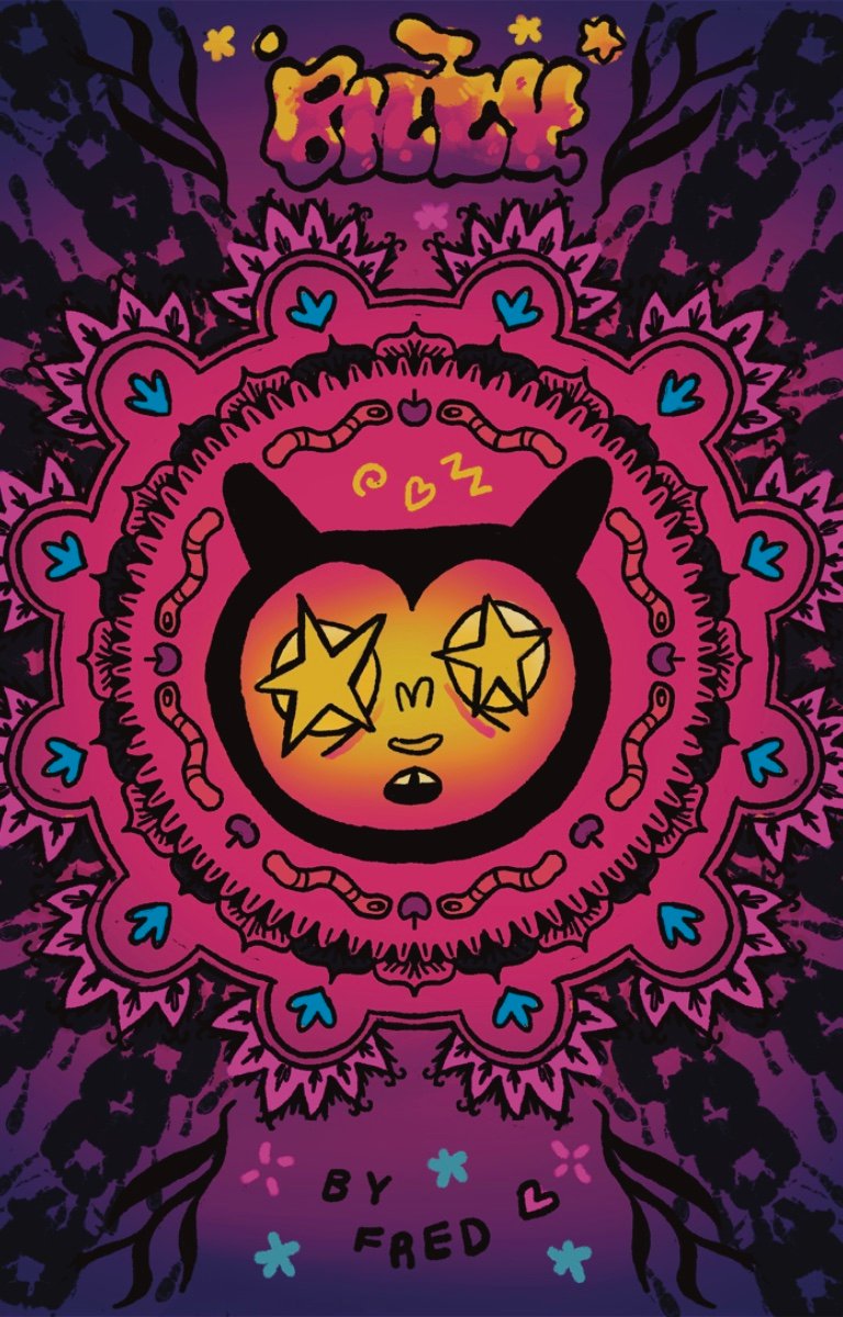
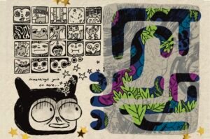
Billy the alien boy is lost in the world, he can’t seem to find his place or understand why people don’t like him too much. He lives alone in the desert, the stars keep him company but they don’t talk back. He meets a little worm and embarks on the great quest of returning her to worm town !!
Billy is an adult fiction that explores navigating life’s trials and tribulations. The journey of the character draws from the typical Germanic fairy-tale structure, serving as a fable that can be interpreted differently by each reader. It has, however, resonated with an autistic audience because of the cosy style and Billy’s lack of social awareness (that many autistic individuals find relatable).
Contact me if you would like a copy !!
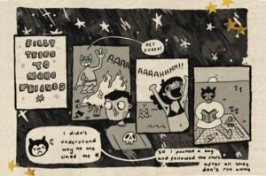
On this page, the protagonist ‘Billy’ tries to make friends, unsuccessfully. I leaned into the physical comedy as well as drawing from a variety of comics to nail down the composition and pacing !!
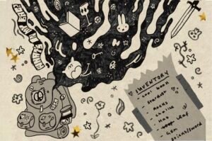
I was able to explore and develop the character through more conceptual pages like this. This page in particular is riddled with clues and easter eggs for the audience to learn more about his character.
In the final page of the comic, I wanted to completely deconstruct the structure of the comic. In this page, Billy licks a frog in a hungry desperation; the breaking of borders and introduction of colour at the very end is indicative of the psychedelic trip he’s about to take….
Ocean Conservation Trust Campaign
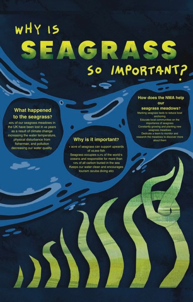
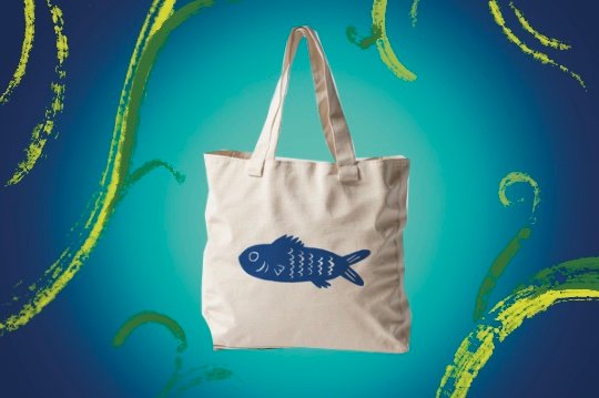
This campaign was created to advocate and spread awareness about the incredible work of the OCT. The National Marine Aquarium, in Plymouth, has always held a special place in my heart; their space is not only gorgeous but extremely informative and makes ocean exploration accessible to all. I spent a couple of weeks familiarizing myself with their conservation work in restoring seagrass meadows, as well as researching the internal systems within the aquarium that ensures each creature lives an enriched life. Following this, I conducted research into their brand identity, making sure my campaign would fit into their larger body of work. I was able to create the infographic to the right, as well as two mock-ups for merch concepts.
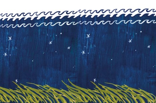
Above is one of my concepts for the background for the infographic. I utilised watercolour, coloured pencils and procreate to create a repeatable pattern that could be used for a larger graphic within the aquarium.
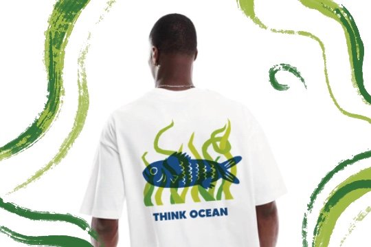
This is the concept for the back of my t-shirt design. The OCT’s slogan is at the bottom, I layered papercuts over a sketch of a fish, arranging it digitally to present to the client.
With the tote mock-up, I wanted to have a simpler, more striking design that people could day to day. The goal with the merch designs was to be able to integrate it in a discreet way that would start more conversations in the real world.
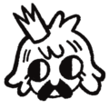
Princess Fred
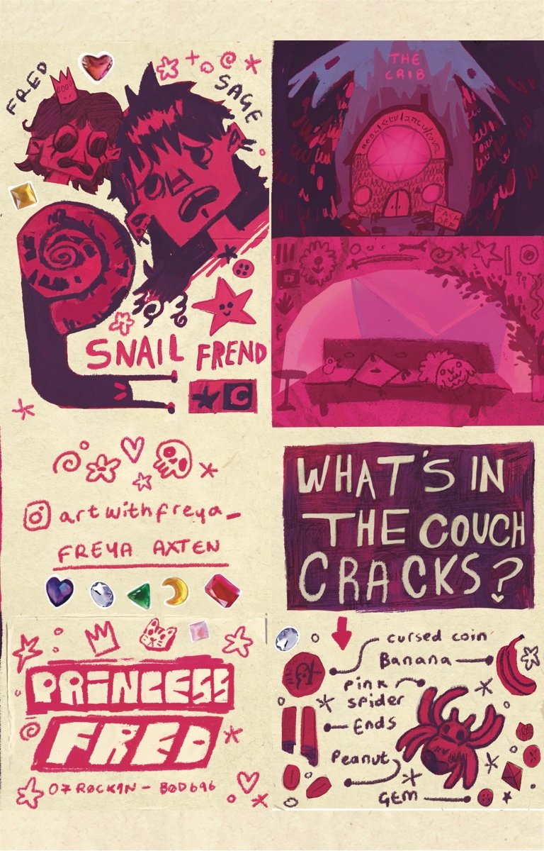
My comic Princess Fred was a highlight of my time at university. Drawing from personal experiences with being stalked, I was able to trivialise it through a fantastical lens, making it feel less scary to me and hopefully my audience.
The character Princess Fred was designed to be a sweet, unassuming hero, girlish with large eyes and a little crown. I find comedy easier to write with a duo, the interactions between them and playing on different character traits. Sage is the cynical, more realistic counterpart to whimsical Princess Fred. The antagonist Villain Murphy is the silent wizard, always there, intentions unknown to Fred and Sage. With stalking there’s an obsession and an element of control, I don’t believe the intention is always to hurt but moreso the selfish desire to see that person, keep tabs on them.
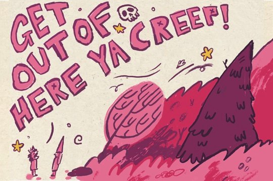
The comic was left unfinished, as I couldn’t figure out what happened after Princess Fred told him to ‘Get out of here !’. I think this is true to life, as every day with a stalker feels like a constant battle of what comes next, the day they leave, you are forced to reconcile with the what, why and how.
First page of the comic, scene of Princess Fred and Sage the Witch chilling in the living room. I used colour and items in the room to suggest the hardships that were to come.
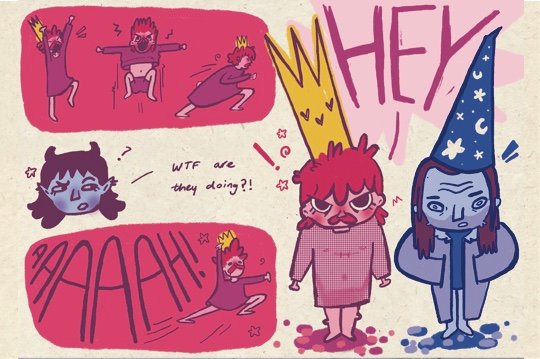
The confrontation where Fred finally stands her ground and calls out Villain. In real life, its not a good idea to physically confront a stalker but this page is more of a cathartic exploration of the impact of stalking. We see a different side of Fred, she steps into the hero role !!
In the penultimate page, Fred calls out Villain and ends the debacle. Her anger and emotion so immense that it shakes the forest. This page exemplifies and explores raw female rage !!
Where to Do They Go?
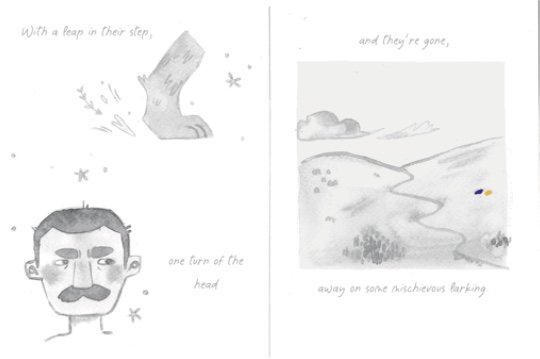
In my second year of university I had the pleasure of adapting a poem in a 32 page children’s book. This project was colossal but super fun!! This was my first proper narrative project, I had to grasp how to organise a large project, learn character and background design basics as well creating a cohesive visual language.
The poem follows the journey of two dogs exploring the Welsh countryside. In turn, my narrative explores the beauty of the British landscape. It serves as a celebration of the earth and nature, the ground that holds us and nourishes us. I also challenged myself to create this out of traditional media only, everything was hand painted with ink or collaged (leaning into the unpredictability of nature).
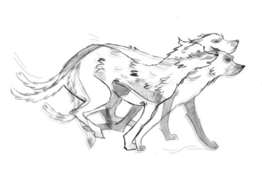
This was one of my favourite pages in the book, I layered ink lines of the dogs over each other with tracing paper and scanned them in over each other. I also used charocoal to add texture.
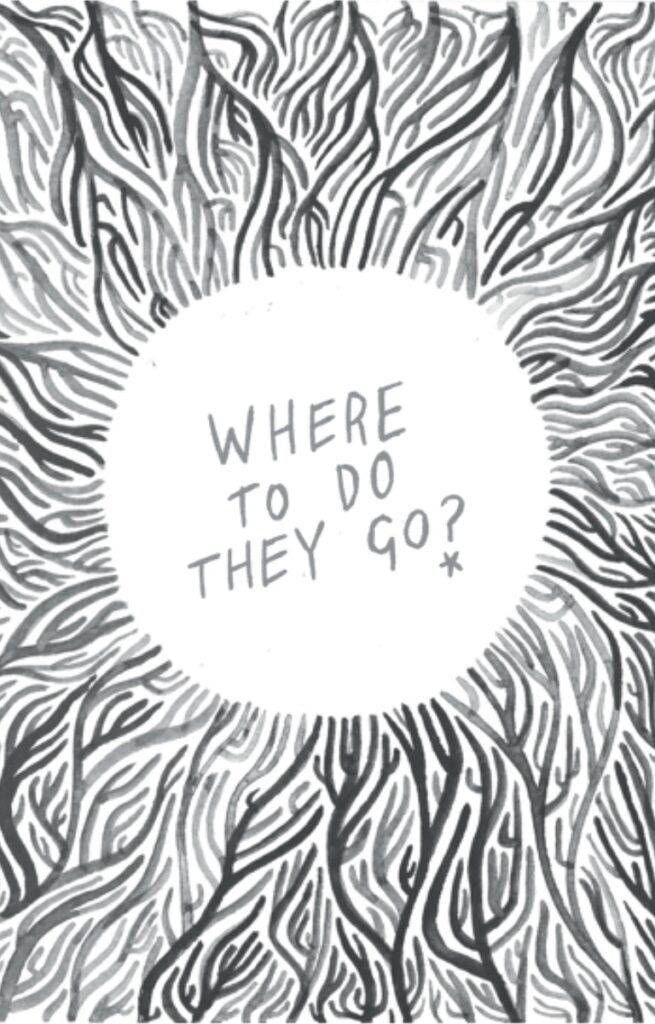
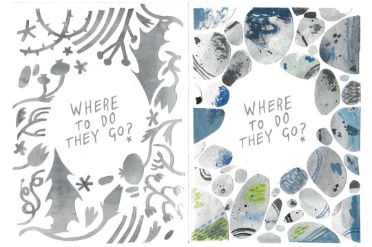
The titular refrain ‘Where to Do They Go?’ was the poignant line which resonated with me in the first place. I wanted to capture this childlike curiosity within the arrangement of little trinkets into controlled patterns.
Here I experimented with spot illustrations to show the vastness of the land compared to these tiny dogs. The farmer is representative of civilisation and a lack of connection to the whimsy that rules the dogs’ worlds.